

Great data visualization tools that you can use to display data beautifully
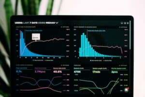
Photo by Luke Chesser on Unsplash
As a data scientist, you need to visualize, interpret, and understand huge datasets every day. While it is difficult for the human brain to depict trends in such datasets, there are visualization tools that do an amazing job.
Even managers in leading positions don’t analyze data every day. Thus, they may experience difficulties understanding what an Excel sheet displays. Many of them even struggle to use these insights.
Data visualization tools, on the other hand, assign data context. As a data scientist, you would be able to communicate your findings efficiently. An additional benefit is that you get to explain data science to audiences that are not familiar with it. Better yet, you will be able to understand what this data means, and how it can be useful for important business decisions.
The perfect data visualization tools every data scientist should try
We’ve assembled some of the best data visualization tools that can make your work more efficient. Go through the 8 most prominent examples and choose the tool that works best for you.
wpDataTables
wpDataTables is a popular WordPress tables plugin that has an array of unique features. You’d be able to build your custom interactive charts that are responsive and easy to edit. Plus, the tool is very quick in analyzing data, even if we are talking millions and millions of rows.
First of all, the user creates a table and edits the content, and uses it as a data source to create an interactive chart. The rows, cells, or even columns of that chart can be formatted in all possible ways, and even color-coded to highlight important information.
All tables, including MySQL-based data or spreadsheets, should be created manually. Note that the tool accepts all leading data formats.
Tableau
If you are into data science, there is no way you haven’t heard of Tableau. This leading data visualization tool not only creates, but also interprets charts, maps, and graphs. Its key advantage is the possibility to connect and combine multiple data sources within minutes.
All Tableau projects are shareable, which means you can collaborate within a team. The original product is called Tableau Desktop, and it is used to create static visualizations for websites. You need a more advanced version if you want to create interactive maps.
There is also a free tool called Tableau Public. It is great for simple data extraction and tables, but you may find it a bit limited in comparison to Tableau Desktop.
Note, however, that there is a learning curve when it comes to Tableau. Yet, the tool is worth both your time and your resources, as it can help you make more informed decisions.
QlikView
In the data science world, QlikView is described as a data discovery platform. It is not limited to data visualization. Instead, it accelerates analytics and provides insights you weren’t aiming for. On top of that, it guarantees that the results you get are accurate.
It used to be a simple development kit used by organizations worldwide, but it grew into a true leader. Nowadays, you can use it to combine all sorts of data sources and create amazing, color-coded visualizations. You can display information in pie charts, tables, graphs, sliders, and much more.
What you will also like about it is the easy drag-and-drop visualization interface. You can bring in data within seconds and understand what it means, no coding is required whatsoever. In comparison to Tableau, QlikView is much easier to learn and use.
Microsoft Power BI
This tool was designed exclusively for business intelligence. You can pull out advanced reports, work out analytics without expert help, and even predict future developments. As Microsoft reports, there are more than 200 000 organizations around the globe making use of their BI tool.
The end-user platform also enables you to share insights in a team and to create combined reports. Power BI also serves as a compact repository for business data which is safe and responsive all the time. Better yet, the tool integrates with leading SaaS platforms. Examples include Office 365, Google Analytics, and MailChimp.
Such integrations make it possible to keep the team on the same page and to standardize the reporting process for all business units.
Datawrapper
You can use Datawrapper in many different ways. You will find it easy and inviting, despite its limited reporting capabilities.
How does it work? This tool lets you create charts and maps on a single dashboard, just by uploading files from your device. Speaking of devices, the tool is responsive and usable on all devices, which means you can use it on the go.
In short, Datawrapper was designed for everyone, especially if you opt for the free version. However, the free version only lets you upload .tsv, .csv, or .txt files limited to 5MB of data at a time. If you want more possibilities, you need to choose the paid version.
Plotly
Plotly specializes in maps and interactive graphs. It can also be applied to visualize a dataset and share links to valuable insights on any website or social media you are using. If you have a lot of followers interested in what you do, this is the right tool for you.
Each of the graphs created with Plotly is interactive and possesses its URL. This means that the focus is still on sharing, and readers can understand both the information and the data points you are offering them. At the same time, you can choose from a variety of plots and maps.
The datasets and the plots are easy to understand. Readers can explore the visuals without having to decipher what you are trying to tell them.
More importantly, the graphs are appealing and simpler than ever before. The same goes for the user interface and open-source visualization tools, which make analysis easier than ever before.
Sisense
Sisense is another great solution that turns raw data into interactive visualizations. The feature-rich tool helps create informative and extensive dashboards. To make matters even better, it guarantees a unique level of data clarity. No wonder it is used by some of the biggest corporations in the world.
The interface is intuitive but simple. It lets you bring in data with a drag-and-drop function and come up with stunning visualizations with only a few clicks.
It integrates seamlessly with leading BI providers: Tableau, Pentaho, QlikView, and Microsoft Excel.
Last but not least, Sisense offers multi-dimensional in-memory technology for Big Data analysis. Its powerful AI engine can conduct predictive analysis. It enables you to discover trends and unexpected patterns for every dataset.
Summary
Nowadays, it is more important than ever to discover what our data tell us. Brands need to decode trends and patterns and interpret their meaning. Only in such a way they can conduct successful business operations and make smarter decisions.
Luckily, this is no longer done manually and by handpicked data scientists. Multiple great AI-enabled data visualization tools master the craft. Some of them are even enabled to keep up with big data and to follow the ever more powerful realms of ML and AI.